How to make a better map of regions
Because the one from LSM is painful to look at
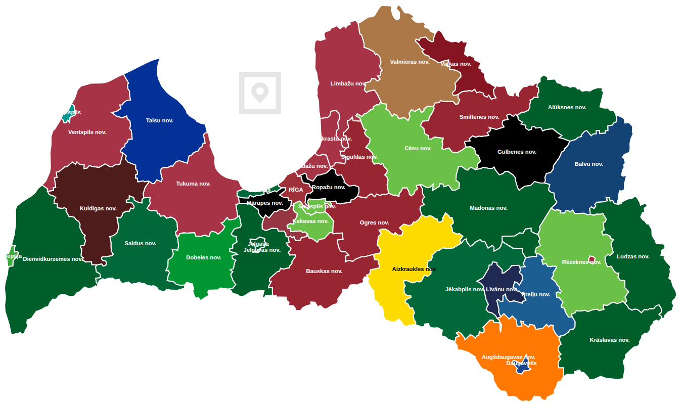
This summer, you might have noticed this map from LSM of the Latvian regional election results, where each region is coloured according to the electoral list that received the most votes.
This map is actually not that bad on the website. Hovering over a region, you can see the electoral lists and the votes they received. And if you press on a region, you can see further information, such as how many seats each list received.
However, purely as an image, this map is hair-raising. Briefly, here are the main crimes:
- There are so many shades of green, blue and maroon that some of them are basically impossible to tell apart.
Olaine, Rīga and Ādaži had three different winners in this election.
- Between the region of Madona and the former region of Varakļāni, there is still a boundary displayed.
- Regional boundaries, the background, and the names of the regions are all in white, hence many of the names are tough to read.
Though, for some reason, the region of Aizkraukle has a black label.
Idea
These issues have a simple solution: use a dark background and apply striped patterns to some of the regions. Here is the result of such an experiment:
If you are on your phone, turn it horizontally.
Now it is clear that Olaine, Rīga and Ādaži indeed had three different winners.
Here is an introduction to how such a map can be made with Python and Javascript/Leaflet.
Python
First of all, we need to make a file containing the regions as polygons, the winners and their colours. To this end, Python with the geopandas library can be used.
To begin, we can download the dataset created by the State Land Service, and save two files from it called Novadi.shp (containing regions) and Pilsetas.shp (containing cities).
The file
Pilsetas.shpcontains all cities in Latvia. We only want to keep the cities that have separate elections; in theCITY_TYPEcolumn, they are assigned the value2.
Using these files, we can make a table containing all the regions and their shapes.
1
2
3
4
5
6
7
8
9
10
11
12
13
14
import geopandas as gpd, pandas as pd

nov = gpd.read_file("Novadi.shp")
pil = gpd.read_file("Pilsetas.shp")

# Combine Madona and Varakļāni
nov.loc[nov["LABEL"] == "Varakļānu nov.", "LABEL"] = "Madonas nov."
nov = nov.dissolve(by="LABEL").reset_index()

# Add cities that have separate elections
nov = pd.concat([nov, pil[pil["CITY_TYPE"] == 2]]).reset_index()

# Keep only their names and shapes
nov = nov[["LABEL", "geometry"]]
Then, we can add the results. For this purpose, I used Google Sheets and manually created a table winners.tsv with the name of each region, their respective winners and party colours.
We combine our existing table nov with this table of winners, and export the results in a GeoJSON format. At the end, we also switch to the EPSG:4326 coordinate system which is expected by Leaflet.
1
2
3
4
5
6
7
8
# Read the table of winners
win = pd.read_csv("winners.tsv", sep='\t')

# Combine regions and shapes with winners
res = nov.merge(win, on="LABEL")

# Make a GeoJSON file using the resulting table
res.to_crs(epsg=4326).to_file("election_data.geojson", driver="GeoJSON")
Javascript / Leaflet
The data in our GeoJSON file can be displayed, for instance, using Leaflet. Admittedly, the code for doing so is fairly long, so this serves only as a summary of the main ideas. The full code is available on GitHub.
First, we can make a primitive HTML page. To use Leaflet, we add the library and its stylesheet, as well as leaflet.pattern.js, which can be downloaded from GitHub. We read the GeoJSON file and store its contents as data.
1
2
3
4
5
6
7
8
9
10
11
12
13
14
15
16
17
18
19
20
21
<!DOCTYPE html>
<html>
<head>
  <meta charset="utf-8" />
  <meta name="viewport" content="width=device-width, initial-scale=1.0">
  <link rel="stylesheet" href="https://unpkg.com/leaflet/dist/leaflet.css" />
  <style>
    /* CSS style goes here */
  </style>
</head>
<body>
  <div id="map"></div>
  <script src="https://unpkg.com/leaflet/dist/leaflet.js"></script>
  <script src="leaflet.pattern.js"></script>
  <script>
    fetch('election_data.geojson').then(response => response.json()).then(data => {
      /* JavaScript code goes here */
    });
  </script>
</body>
</html>
Using JavaScript, we first create a static map const map = L.map('map', { /* ... */ }), and then add the information from the file sort of as below:
1
2
3
4
5
6
7
8
9
10
11
12
13
14
15
16
17
18
19
20
21
22
23
24
25
26
27
28
29
30
31
32
33
34
// Make layer with file contents
const geojsonLayer = L.geoJSON(data, {
  onEachFeature: function (feature, layer) {
    // Add region in the secondary colour
    L.geoJSON(feature, {
      style: {
          fillColor: feature.properties.secondaryColor,
          /* ... */
      }
    }).addTo(map);

    // Add thick stripes in the primary colour
    const pattern = new L.StripePattern({
      color: feature.properties.mainColor,
      /* ... */
    });
    pattern.addTo(map);
    layer.setStyle({
      fillPattern: pattern,
      /* ... */
    });

    // And add a tooltip to display when hovering over a region
    layer.bindTooltip(/* ... */);
  }
});

// Add this layer to the map
geojsonLayer.addTo(map);

// Set zoom level
map.fitBounds(geojsonLayer.getBounds(), { padding: [20, 20] });
map.touchZoom.disable();
// Here we can add code to reset the zoom level if the map size changes
Once the map has been created, we can finally add the labels of the regions. Unfortunately, Leaflet does not really have any great method that would guarantee the visibility of all labels, but we can achieve something along those lines manually.
1
2
3
4
5
6
7
8
9
10
11
12
13
14
15
16
17
18
19
map.whenReady(() => {
  geojsonLayer.eachLayer(layer => {
    const label = layer.feature.properties.LABEL;
    const center = layer.getBounds().getCenter();

    // One can first make a dictionary - how to shift the positions, so they do not overlap
    const offset = labelOffsets[label] || [0, 0];
    const offsetLatLng = {"lat": center["lat"] + offset[1], "lng": center["lng"] + offset[0]};

    // Add the label
    L.marker(offsetLatLng, {
      icon: L.divIcon({
        html: label,
        /* ... */
      }),
      interactive: false
    }).addTo(map);
  });
});
All that is left is to add some CSS for styling, and the new map is done!
Possible improvements
There are different ways to improve the map. LSM have already done the following two:
- Add more data. For us, this might be easier, if and when the website data.gov.lv has a published dataset of the full election results.
- Introduce further interactivity, for instance, by redirecting the user to further results whenever a region is pressed.
But on top of that, we could:
- Find a more effective method or strategy for placing labels on the map.
- Choose nicer colour combinations and patterns, perhaps with a focus on accessibility for colourblind users.
- Consider another style! There are many interesting ways to display election results. Here is one example.
Either way, the visual changes made here are simple. Hopefully, LSM will perform such changes eventually.